Federal Court Font Rules, From Century Schoolbook to Comic Sans
Many federal judges set font rules in their standing orders, down to the typeface, the point size and the size of footnotes.
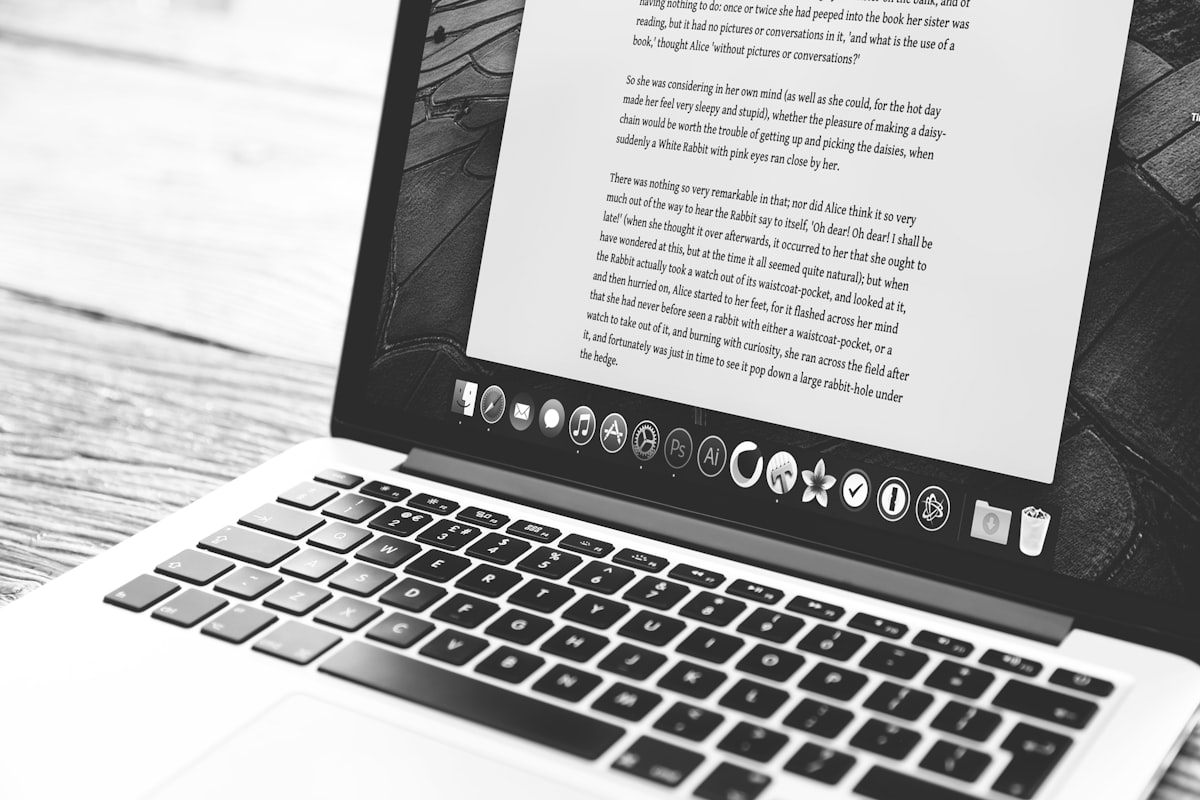
Standing orders across 20 federal districts set rules about page limits, filing deadlines and motion formatting, and many of them also set rules about fonts.
Some standing orders set the exact point size for footnotes, and some ban specific typefaces by name. At least one judge has updated her font requirements three times in five years.
1. Century Schoolbook
Century Schoolbook is a common choice in the federal judiciary. The Supreme Court uses it for its briefs, and several circuit courts require it. Many district judges also specify it in their individual practices, often with a note on why they prefer it to Times New Roman.
The reason is readability, because Century Schoolbook was designed in 1924 for children's textbooks. Its letterforms are rounder, its x-height is larger, and its spacing is more generous, which helps a judge who reads 40 briefs a week. Several standing orders give these reasons.
"All filings shall use Century Schoolbook in 14-point type. Times New Roman is not acceptable."
The order is from a judge in the Southern District of New York, and it calls the font not acceptable.
2. 14-point type
Most local rules default to 12-point type, but more judges now require 14-point. They give reasons such as reading on screens, and the fact that 12-point Century Schoolbook and 12-point Times New Roman fit different amounts of text on a page.
If the local rule says 12-point and the assigned judge says 14-point, the judge's rule applies and the page limit stays the same, so you lose about 15% of the space.
3. Footnotes
Some judges see footnotes as a way around page limits, because a lawyer can set them in 10-point type and move less important arguments into them. Those judges set specific rules for footnotes.
"Footnotes must be in the same typeface and point size as the body text. No exceptions."
Other judges go further and ban substantive footnotes entirely. One standing order in the Eastern District of Texas says footnotes may contain only citations, never argument. The line between citation and argument is hard to draw in a footnote that says "See generally" and then gives three sentences of context.
4. Garamond
Garamond, depending on the version, is noticeably smaller than Times New Roman at the same point size. Matthew Butterick (the lawyer-typographer behind Typography for Lawyers) recommends it, and some judges have followed his advice.
When a judge specifies "Garamond" without saying which version, the page count can change with the version you use. Adobe Garamond Pro, Garamond Premier Pro, EB Garamond and the version bundled with Windows are all slightly different, and with the wrong one a 25-page brief might render as 27 pages on the clerk's screen.
5. Courier New
A handful of judges still require Courier New, usually for specific document types like proposed orders or transcripts. The rule dates from typewriters, because Courier makes it easy to count characters per line.
A brief in Courier New looks different from the rest of the docket, and the judges who require it accept that, because they want each document to be consistent.
6. Comic Sans
We couldn't find a standing order that names Comic Sans by name. But several orders effectively prohibit it through restrictions like "a proportionally spaced serif typeface commonly used in legal documents." Comic Sans is sans-serif and is not commonly used in legal documents.
Comic Sans has been used in federal filings. A 2020 motion in the Southern District of Florida was submitted entirely in Comic Sans, and the judge did not comment on the font. The motion was denied on the merits.
7. Embedded fonts in PDFs
CM/ECF requires PDF submissions, and a PDF that doesn't embed its fonts is shown in whatever default font the viewer uses. A brief set in Century Schoolbook can then appear in Helvetica, with different spacing, line breaks and page count.
At least three districts include font embedding requirements in their local rules. Some judges also include them in their standing orders, in a section about "electronic filing specifications".
8. Word limits instead of page limits
Page limits depend on the font. A 25-page brief in 12-point Times New Roman contains about 6,250 words, and the same brief in 14-point Century Schoolbook contains about 4,500, which is 28% less.
Some judges use word limits instead of page limits. The Federal Rules of Appellate Procedure already use word counts (13,000 words for a principal brief), and more district judges have done the same. With a 7,000-word limit, the font affects readability but not length.
9. A judge who changed her font rule three times
One judge in the District of New Jersey has amended her font requirements three times since 2023, from Times New Roman 12-point to Century Schoolbook 13-point and then to Book Antiqua 14-point. Each change came with an updated standing order and a new effective date, and none gave a reason.
A brief prepared from the version of six months ago may be in the wrong font if nobody checked for amendments.
Why font rules affect filings
Clerks check format before they docket a filing, and a wrong font, size or footnote format can lead to a deficiency notice that costs days.
CourtRules.app collects the formatting requirements that differ from judge to judge and change without notice.